

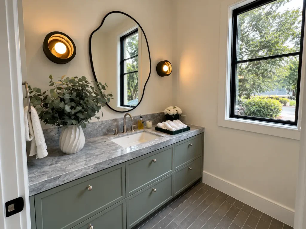
Neutral bathroom paint colors are the most requested finish category in residential bathroom remodeling, and the most frequently misapplied. The word neutral implies a safe, uncomplicated choice. Selecting a paint color that reads balanced across the range of light a bathroom sees throughout the day is one of the more demanding finish decisions in any renovation.
Most homeowners pick from a chip under store lighting or from a screen that bears no relationship to the actual conditions of their bathroom. The color goes on, and the result is too warm, too cool, too green, or too purple, depending on which undertone the neutral is carrying and how it reacts to the space’s light sources, tile, and fixtures.
At Lone Star Remodeling & Construction, color selection is part of the planning conversation during any interior painting project, because a paint decision made after tile is set and fixtures are installed is a decision made with incomplete information.
Why Neutral Is Not the Same as Simple
The category of neutral bathroom paint colors covers whites, off-whites, warm grays, cool grays, greige tones, and soft taupes. What they share is the absence of a strong chromatic identity in isolation. What they don’t share is a neutral undertone, and that distinction is where most bathroom paint decisions go sideways.
Every neutral carries a secondary hue beneath its surface. A white with a green undertone reads clean and slightly cool against white subway tile and chrome fixtures. Against warm beige tile and brushed gold hardware, the same white reads greenish in a way that feels unintentional. That shift is not a defect. It is a predictable consequence of how human vision processes color in context, and it happens whether or not anyone anticipated it during the selection process.
Warm undertones pull toward yellow, peach, or pink. Cool undertones pull toward blue, green, or purple. Neutrals that sit closest to true gray carry both in rough balance, which makes them the most light sensitive of all because they tend to shift toward whichever undertone the surrounding environment amplifies on any given afternoon.
How Light Changes Neutral Paint Colors Through the Day
Natural light in a bathroom in the Dallas area changes a lot from morning to late afternoon and that change affects how every surface looks. A neutral paint color in a bathroom that feels warm and nice at 8:00 AM can seem dull or cold at 2:00 PM depending on where the windows are how the light feels.
Bathrooms that face north get light that comes from the sky of directly from the sun. This light has a bluer feel that makes cool colors stand out more and warm colors look less. Neutral paint colors with colors help make up for this change better than cool gray colors, which can look very cold in the same situation. Bathrooms that face south in North Texas get direct light most of the day. Neutral colors with colors tend to look more yellow or orange under this light. Colors with colors work better because the warm light brings them into balance instead of making them too strong.
Light from inside the house adds another factor that works on its own not based on where the windows are. Warm light bulbs that are between 2700K and 3000K make warm colors look more warm which can make a neutral color with a yellow base feel much warmer at night than it did during the day. Light bulbs that match daylight, between 4000K and 5000K make cool colors look more visible and can make certain white colors feel too clean in a space that felt right in natural light. Checking a paint color in a bathroom using both natural light at different times of the day and the actual light sources that will be used in the finished bathroom is the only way to see how the color really works.
Identifying Undertones Before You Commit
Identifying the undertone in a neutral paint color before it goes on the wall requires a specific evaluation method, not a glance at a chip in a paint aisle. The most reliable approach is to hold the chip against a bright white reference, such as a sheet of printer paper, and observe how the color shifts in comparison. A white with a pink undertone reads as slightly rosy. One with a green undertone reads cooler. One with a yellow base reads creamy. Those differences are barely perceptible in isolation and immediately apparent on four walls of a bathroom.
After the chip comparison, place a large sample swatch on the actual wall and observe it across different hours of the day, under both natural and artificial light. A greige with a strong pink undertone placed next to cool white tile reads as a mismatch in many bathrooms. Against warm ivory tile, the same greige reads grounded and harmonious. The tile is fixed. The neutral bathroom paint colors you evaluate need to work with it, not around it.
Grout color is a variable most homeowners underestimate in this evaluation. A light gray grout network across a white tile wall creates a visual pattern that reads either warm or cool depending on the grout’s own undertone, and that undertone affects how adjacent wall paint reads in the same way tile does. Including grout in the swatch evaluation before finalizing any paint selection is worth the additional step.
Sheen Selection for Moisture Resistant Bathroom Paint
Sheen in a bathroom is a moisture management decision before it is an aesthetic one. Selecting the wrong sheen for a specific zone of the bathroom creates maintenance problems that compound over time regardless of how well the color was chosen.
Moisture resistant bathroom paint in a satin or semi-gloss finish is the appropriate specification for walls within direct water contact range: around the tub surround, the transition zone where tile ends and drywall begins, and the area around the sink. These sheens form a harder, less porous surface than matte or eggshell finishes, resist moisture penetration more effectively, and clean easily when soap residue and water accumulate on the surface.
Satin is the more common specification for bathroom walls overall because it offers adequate moisture resistance with less reflectivity than semi-gloss, which can amplify surface imperfections and feel harsh in smaller bathrooms. Semi-gloss is better suited to trim, door casings, and areas in close proximity to water. Matte paint in a bathroom is a recurring design aspiration that creates recurring maintenance problems. Even washable matte formulas are a compromise in high-humidity zones. In low moisture areas like the ceiling or the wall above the door, a washable matte is a viable option. Directly near water, satin or semi-gloss is the correct call.
Neutral Bathroom Paint Colors With Existing Tile
In most bathroom renovation projects, tile is set before paint goes on the wall. That sequence makes the tile the fixed point around which every finish decision, including neutral bathroom paint colors, needs to be calibrated. A color chosen in isolation from the existing tile frequently produces a bathroom that looks like two separate design decisions sharing the same room.
White and off-white tile, the most common specification in Dallas area residential bathrooms, is simultaneously the most forgiving and the most demanding backdrop for neutral paint. Forgiving because most neutrals pair with white tile without an outright clash. Demanding because white tile amplifies undertones in adjacent paint colors more than most other tile colors, making a barely perceptible pink or green undertone suddenly visible from across the room.
Warm-toned tile in ivory, cream, sand, or beige calls for neutral paint colors with enough warmth to read as harmonious without feeling identical to the tile. Cool-toned gray or charcoal tile handles both warm and cool paint colors but creates different effects with each. Patterned tile, whether geometric porcelain, encaustic cement, or a classic Saltillo installation, already carries significant visual weight and typically works best with neutral bathroom paint colors that sit back far enough to let the tile read as the primary element rather than competing with it.
Neutral Paint Strategies for Bathrooms With Limited Natural Light
A significant number of bathrooms in Dallas area homes, particularly secondary bathrooms, half baths, and interior master bath layouts, have no window or only a small frosted panel that admits light without providing much of it. Neutral bathroom paint colors in these spaces operate entirely under artificial light, which changes the selection criteria considerably.
In a windowless bathroom, warm-toned neutrals in the off-white to soft greige range perform better than cool ones because they respond more favorably to the warm light temperatures typical of residential vanity fixtures. A warm white under a 2700K to 3000K light source reads clean and inviting. A cool gray under the same temperature reads flat and slightly dull.
Lighter values within the neutral range reflect available artificial light more efficiently and keep the space from feeling absorbed into itself. A deep taupe or dark greige can work in a small, windowless bathroom if the fixture lighting is well positioned and adequately powered, but it requires a more deliberate lighting design to carry the color.
Coordinating Paint With Fixture Finishes
The finish on bathroom fixtures affects neutral bathroom paint colors in ways that can be seen every day. Warm metal finishes such as brushed gold, brass and oil rubbed bronze pull warm undertones forward in adjacent paint and suppress cool undertones.
A neutral paint with a warm undertone paired with brushed gold fixtures looks like a deliberate cohesive choice. The same paint paired with chrome looks like a mismatch because the cool fixture makes the warm paint appear more yellow by contrast. These interactions are predictable and worth mapping before fixtures and paint are finalized together.
Matte black fixtures have become a specification in contemporary bathroom design and they interact differently with neutral paint colors than any metallic finish. Matte black absorbs light by reflecting it so it does not amplify or suppress undertones in adjacent paint the way metals do. Neutral bathroom paint colors across the cool spectrum pair with matte black more consistently than with any other fixture finish. This is one reason the combination appears reliably in bathroom renovations where the homeowner wants flexibility, in color selection without a significant coordination risk.
The Decisions That Need to Happen Before the Can Opens
Neutral bathroom paint colors that perform well over time are chosen with the same rigor applied to any other finish in a bathroom renovation. They account for the fixed surfaces they have to coexist with, the light conditions they will perform under daily, and the moisture realities of a space that generates humidity every morning. A color that satisfies all three criteria requires more evaluation time upfront and significantly less frustration once it is on the walls.
The sequence matters. Evaluate undertones against actual tile and grout in the existing bathroom. Test large sample swatches on the wall under natural and artificial light across a full day. Confirm sheen selection based on the moisture exposure of each zone. Map the paint palette against the fixture finishes already specified or installed.
Reach out to Lone Star Remodeling & Construction to share your bathroom goals and map the decisions that neutral bathroom paint colors require, from undertone evaluation and sheen selection through coordination with your existing tile and fixture finishes.
FAQ
How do I find the undertone in a neutral bathroom paint color?
Hold the chip against a bright white reference, such as a sheet of printer paper, and observe how the color shifts by comparison. Then place a large sample swatch on the actual bathroom wall and evaluate it under natural light at different times of day and under your bathroom’s artificial lighting at night.
What paint sheen is best for bathroom walls?
Satin is the most consistently appropriate sheen for bathroom walls. It offers adequate moisture resistance, cleans without degrading the surface, and reflects less light than semi-gloss in a way that reads better in most residential bathrooms. Semi-gloss is appropriate for trim and areas in direct proximity to water.
Why do neutral paint colors sometimes look purple or green on bathroom walls?
Purple and green casts in neutral paint colors are undertone reactions amplified by surrounding surfaces and light conditions. A gray with a slight purple undertone reads balanced in isolation and noticeably purple in a bathroom where warm vanity lighting and white tile collectively push that secondary hue forward.
Can I use the same neutral paint color in the bathroom and the adjacent hallway?
Using the same neutral across both spaces can create visual continuity if the light conditions between the two spaces are similar. If the bathroom has significantly different light exposure than the hallway, the same color may read differently enough between the two that the continuity feels coincidental rather than intentional.
What neutral bathroom paint colors work best in Dallas homes?
Dallas bathrooms with south or west facing light benefit from neutral paint colors with cooler undertones that remain balanced when warm Texas sunlight intensifies them through the afternoon hours. North facing and interior bathrooms with primarily artificial light tend to work better with neutrals that have warm undertones, since the cooler ambient light compensates for the warmth in the paint rather than stripping it away.