Getting the right color palette selection in the kitchen is important because this is the part of the house that should suit your needs and style. Even if you prefer the basic neutral color design of the interior versus bright colors, there are many choices that you may consider.
This guide will take you through different colors that can be suitable for kitchens in Plano.
Neutral Palettes for a Timeless Look
Here are the following. Take a look!

- Neutral palettes offer flexibility in most kitchen designs which contributes to their popularity, especially for painted kitchen cabinets. They act as a blank canvas where some other decor items such as kitchen appliances and surfaces can flourish.
- White color always is appropriate for the kitchen because it fills the room with light and makes it airy. It helps a lot, especially in small-sized areas where it helps to create the impression of volume through illumination. White is a hue that can be present in several shades namely high shine, which gives off a contemporary look, or even a low sheen sitting matte white. Warmer off-shade colors such as cream or ivory are perfect for introducing in the kitchen and help create warmth.
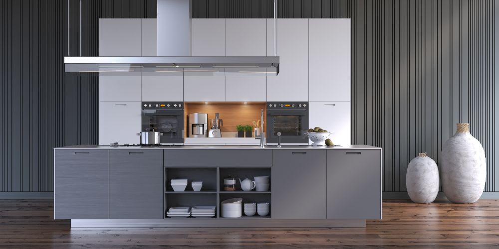
- Gray is an equally useful neutral, which can be light in tone, medium gray, or dark gray. A warm, light gray adds a contemporary flair which is ideal for freshening a room without too much fuss. A medium gray suggests proportions that are comfortable and blend in nicely with both warm and cool undertones. Alternatively, dark gray is more sophisticated and helps to create a more cohesive space, making it suitable for larger kitchens or as a feature wall.
- Beige adds an inviting warmth to the kitchen. It has some sun tan shades that go well with wood furnishings and stone surfaces. There is a beige cream associated with beige as it is a warmer shade with an inviting feel and there is indeed taupe which is a greyish-beige and it is almost dull yet enhances the sophistication of the décor. Dune-shaped beige, however, can lend some zest and peace to the room.
Our kitchen remodeling in Plano will help in creating a kitchen as per your needs.
Bold Color Choices for a Vibrant Kitchen
When equipping the kitchen, bold colors can easily bring that fun and sassy feel or simply that intended wow factor. These colors can be used as the main color or the highlight of the room, thus making your kitchen unique.

- Navy Blue is one that you can use in your kitchen to make it more appealing and cosmopolitan. It also looks good with different finishes and materials, such as white cabinets to create the traditional marine look or gold ones, to enhance the luxury. Navy blue also looks good in combination with wood giving a sophisticated and inviting feel.
- Emerald Green provides a good alternative that is rejuvenating while also making a room feel fresh and helps in ingesting some natural elements of the condition. For a more balanced approach, emerald green can be matched with neutral tones like beige or gray, which help tone down its intensity while maintaining its lively presence. It also blends nicely with wooden finishes, adding an organic and earthy feel.
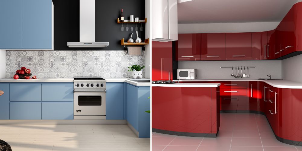
- Bright Red color is always loud and tends to make any kitchen very exciting. It is more useful as an accent color, on just one of the walls or through smaller decorative elements. Overall, When used in moderation, bright red can give that extra heat and cheer without causing a sensation. If this shade of red is too intense for you, it’s best to partner it up with neutral colors like white or gray to balance the entire appearance.
Combining Colors for a Balanced Look
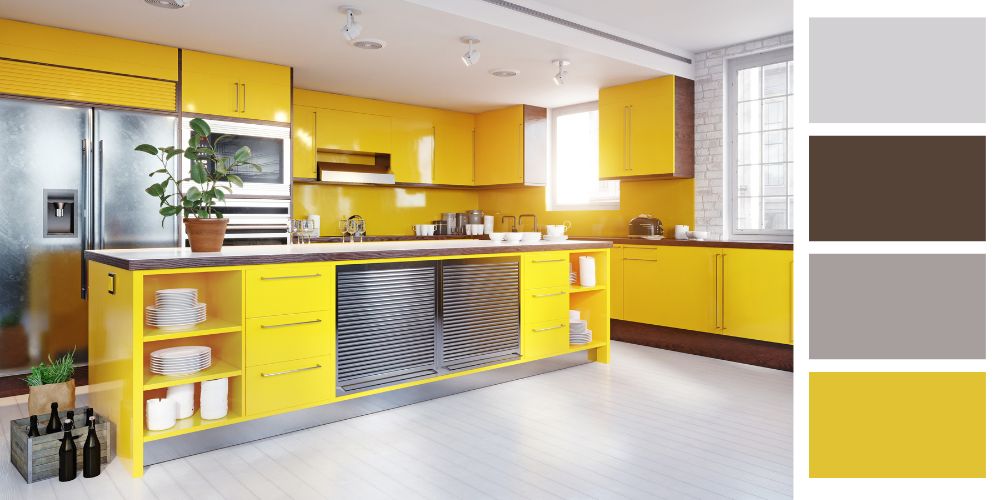
The combination of different colors can create a pleasant and attractive appearance. One effective strategy is to pair neutral colors with bold accents. For example, if the kitchen is white with navy blue throw pillows, it makes the entire kitchen look clean and bright with a touch of drama. Did the same with bright walls—the working surface conflicts complements with grey boring walls in modern style with bright red tights.
Color blocking is another technique where different areas of the kitchen are painted in contrasting colors. This approach can add depth and interest to the space. This technique might help to create dimension and variety in the room. For instance, one would have light gray walls and contrast that with a dark blue kitchen island which gives a nice design pattern.
Moreover, think about the other kitchen design aspects like countertops, backsplashes, and even flooring that your selected colors will influence. Color coordination with these parts can help elevate the design and unity of the place.
Take Help From Experts!
Selecting the right color palette for your kitchen can greatly influence its appearance and functionality. Whether you choose a classic neutral scheme or a bold, vibrant look, there are numerous options to fit your style and preferences.
For expert assistance with your kitchen remodel, contact Lone Star Remodeling and Construction. Discover more about our best Kitchen Remodeling Trends 2024 for your next project.


